Agenda
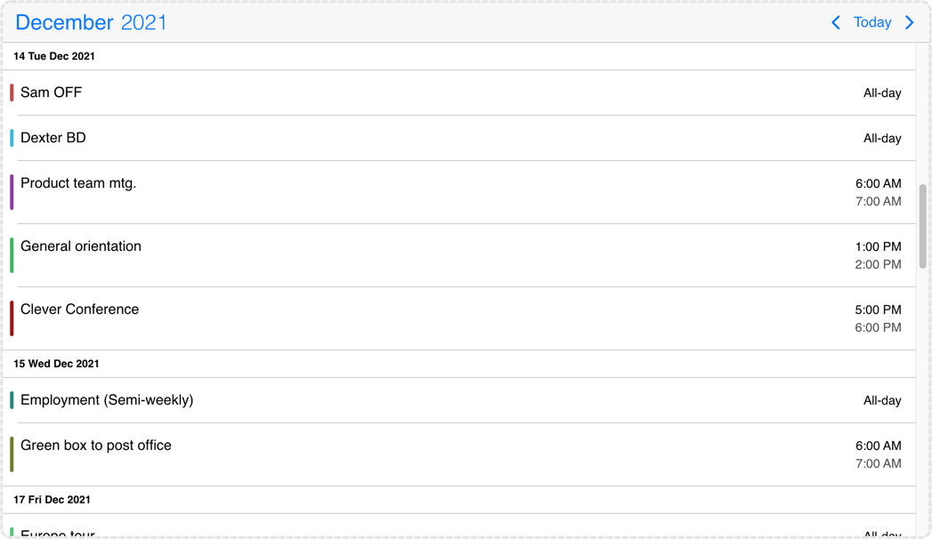
The agenda calendar displays a list of events for a given period of time (year, month, week or day). It can be used as a standalone component or in combination with the calendar.
API
Options
actionableEvents
boolean
Specifies if the events on the agenda and inside the calendar popover are actionable or not.
If actionable, the event items will have hover and active states, and pointer cursor.
Set to false when custom event rendering is used and the event list items contain other actionable elements, e.g. buttons.
Default value: true
cssClass
string
Specifies a custom CSS class for the component.
Default value: undefined
data
Array<MbscCalendarEvent>
The events for the calendar, as an array of event objects. The event object supports the following properties:
allDay: boolean - Specifies if the event is all day or not.color: string - The color of the event.cssClassstring - Custom CSS class for the event. Useful when customization is needed on the event level. For example: setting the width for specific events.dragBetweenResources: boolean - Specifies whether the event is movable across resources. It applies for scheduler and timeline views. Has precedence over theeventDragBetweenResourcesproperty of the resource and the dragBetweenResources option.dragInTime: boolean - Specifies whether the event is movable in time. Has precedence over theeventDragInTimeproperty of the resource and the dragInTime option.editable: boolean - Specifies if an event is editable or not. Setting it tofalsedisables drag & drop, resize and delete,end: Date | string | object - The end of the event.overlap: boolean - Specifies whether any overlap is allowed for the event. Has precedence over theeventOverlapproperty of the resource and the eventOverlap option.id: string | number, Number - A unique id for the event. If not specified, the event will get a generated id. and the event will have thembsc-readonly-eventCSS class. With this class, the fixed events will be easily customizable, for example: add opacity or disable the cursor on the fixed events.recurring: string | object - Recurrence rule for the event.recurringException: string | object | Array<string | object> - Exception dates of the recurring rule. Useful when specific dates need to be skipped from the rule.recurringExceptionRule: string | object - Exception rule of the recurring rule. Useful when recurring dates need to be skipped from the rule.resize: boolean - Specifies whether the event is resizable. Has precedence over theeventResizeproperty of the resource and the dragToResize option.resource: string | number | Array<string | number> - Specifies the resource ids for the event. The event will be displayed only in the specified resources. If there is no resource defined, the event will be displayed in every resource.slot: string | number - Specifies the slot id for the event.start: Date | string | object - The start of the event. The event will be displayed only in the specified slot. If there is no slot defined, the event will be displayed in every slot.title: string - The title of the event.tooltip: string - The tooltip text of the event.
The dates can be specified as JavaScript Date objects, ISO 8601 strings, or moment objects.
The event objects may have additional custom properties as well. The custom properties are not used by the event calendar, but they are kept and will be available anywhere the event objects are used. E.g. the onEventClick event will receive the event object as argument, containing the custom properties as well.
Use the getEvents method to get the events between two dates.
data: [
  {
    start: new Date(2021, 5, 23),
    end: new Date(2021, 5, 30),
    title: 'Conference',
    allDay: true,
    color: 'red'
  },
  {
    title: 'Work project',
    recurring: {
      repeat: 'daily',
      until: '2021-04-01'
    },
    recurringException: ['2021-03-15', '2021-03-25'],
    recurringExceptionRule: {
      repeat: 'weekly',
      weekDays: 'SA,SU'
    }
  }
]
Default value: undefined
dataTimezone
string
The timezone in which the data is interpreted. If the data contains timezone information
(when the ISO string has a timezone offset, e.g. "2021-03-28T01:00:00Z" or "2021-03-28T03:00:00+03:00")
then the data's timezone is used instead.
When using timezones, the exclusiveEndDates option is also turned on by default.
When using anything other than the default ('local'), a timezone plugin
must be also passed to the component.
Possible values:
'local'- The system's local timezone.'utc'- UTC (Universal Coordinated Time) timezone.- Timezone name - The timezone name from the
IANA time zone database, e.g.
"America/New_York".
If not specified, it defaults to the displayTimezone.
Default value: undefined
defaultSelectedDate
DateType
Specifies the initial selected date on the calendar.
Default value: undefined
displayTimezone
string
The timezone in which the data is displayed.
When using timezones, the exclusiveEndDates option is also turned on by default.
When using anything other than the default ('local'), a timezone plugin
must be also passed to the component.
Possible values:
'local'- The system's local timezone.'utc'- UTC (Universal Coordinated Time) timezone.- Timezone name - The timezone name from the
IANA time zone database, e.g.
"America/New_York".
Default value: 'local'
eventOrder
(event1: MbscCalendarEvent, event2: MbscCalendarEvent) => number
exclusiveEndDates
boolean
If true, the Eventcalendar will work in exclusive end dates mode,
meaning that the last moment of the range (event, invalid, colors, etc.) is not part of the range.
E.g. end: '2021-07-03T00:00' means that the event ends on 2nd of July and will not be displayed on 3rd of July.
When using timezones, the exclusiveEndDates option will default to true.
height
string | number
Sets the height of the component.
The height of the calendar view impacts the number of labels that fit into a table cell. A "show more" label will be displayed for events that don't fit.
Default value: undefined
max
DateType
Maximum date and time. The calendar cannot be navigated beyond the specified maximum date. If navigation is needed, but event creation should not be allowed after a specific date, use the invalid option with daily recurrence starting from the specific date.
Default value: undefined
min
DateType
Minimum date and time. The calendar cannot be navigated beyond the specified minimum date. If navigation is needed, but event creation should not be allowed before a specific date, use the invalid option with daily recurrence until the specific date.
Default value: undefined
refDate
DateType
Specifies the reference date of the component, which represents when to start to calculate the view you want to display. For example, if you want to display 14 days from today, you can specify today as the reference date.
If not defined, in case of scheduler and timeline views it will default to today, in other views it will default to '1970/01/01'.
Default value: undefined
responsive
missing
Specifies different options for different container widths, in a form of an object, where the keys are the name of the breakpoints, and the values are objects containing the options for the given breakpoint.
The available width is queried from the container element of the component and not the browsers viewport like in css media queries
There are five predefined breakpoints:
xsmall- min-width: 0pxsmall- min-width: 576pxmedium- min-width: 768pxlarge- min-width: 992pxxlarge- min-width: 1200px
Custom breakpoints can be defined by passing an object containing the breakpoint property specifying the min-width in pixels.
Example:
responsive: {
  small: {
    display: 'bottom'
  },
  custom: { // Custom breakpoint, you can use multiple if needed, but each must have a unique name.
    breakpoint: 600,
    display: 'center'
  },
  large: {
    display: 'anchored'
  }
}
Default value: undefined
selectMultipleEvents
boolean
When true, enables multiple event selection on the calendar.
Default value: false
selectedDate
DateType
Specifies the selected date on the calendar. Setting this option will force the calendar to display the passed date and won't display anything else unless another selected date is set. This is called a controlled usage, and the onSelectedDateChange event can be used to get notified and act on navigational changes.
To set the initially displayed date without a controlled usage, use the defaultSelectedDate option instead.
Default value: undefined
selectedEvents
Array<MbscCalendarEvent>
Specifies the selected events on the calendar. The onSelectedEventsChange event will be fired when the selected events change from the calendar.
Default value: undefined
separator
string
Separator between date and time in the formatted date string.
Default value: ' '
showControls
boolean
Show or hide the calendar header controls: the previous and next buttons, and the current view button together with the year and month picker.
Default value: true
showEventTooltip
boolean
If false, it will hide the native tooltip that shows up when hovering over an event.
Default value: true
theme
string
Specifies the visual appearance of the component.
If it is 'auto' or undefined, the theme will automatically be chosen based on the platform.
If custom themes are also present, they will take precedence over the built in themes, e.g. if there's an iOS based custom theme,
it will be chosen on the iOS platform instead of the default iOS theme.
Supplied themes:
'ios'- iOS theme'material'- Material theme'windows'- Windows theme
It's possible to modify theme colors or create custom themes.
Make sure that the theme you set is included in the downloaded package.
Default value: undefined
themeVariant
"dark" | "light" | "auto"
Controls which variant of the theme will be used (light or dark).
Possible values:
'light'- Use the light variant of the theme.'dark'- Use the dark variant of the theme.'auto'orundefined- Detect the preferred system theme on devices where this is supported.
To use the option with custom themes, make sure to create two custom themes, where the dark version has the same name as the light one,
suffixed with '-dark', e.g.: 'my-theme' and 'my-theme-dark'.
Default value: undefined
timezonePlugin
ITimezonePlugin
Specifies the timezone plugin, which can handle the timezone conversions.
By default the component uses the local timezone of the browser to interpret dates. If you want to interpret dates a different timezone, you will need an external library to handle the timezone conversions. There are two supported libraries: moment-timezone and luxon.
You can specify either the dataTimezone or the displayTimezone or both.
Depending on which external library you use you can pass either the momentTimezone or luxonTimezone
objects. These objects can be imported from the mobiscroll bundle.
Default value: undefined
width
string | number
Sets the width of the component.
Default value: undefined
Events
@destroy
(args: any, inst: any) => void
Triggered when the component is destroyed.
Parameters:
args - The event argument object.
inst - The component instance.
@event-click
(args: MbscEventClickEvent, inst: EventcalendarBase) => void
Triggered when an event is clicked.
Parameters:
args - The event argument with the following properties:
date: Date - The date on which the event was clicked.domEvent: Event - The DOM event of the click.event: MbscCalendarEvent - The clicked calendar event.resource: string | number - The id of the resource where the event was clicked, if resources are set.selected: boolean - Specifies if the day is currently selected or not (before it was clicked).slot: string | number - The id of the slot where the event was clicker, if slots are set.source: 'agenda' | 'calendar' | 'schedule' | 'timeline' | 'popover' - The view where the event was clicked.
inst - The component instance.
@event-deleted
(args: MbscEventDeletedEvent, inst: EventcalendarBase) => void
Triggered when an event is deleted and it is removed from the view.
Parameters:
args - The event argument with the following properties:
- event: MbscCalendarEvent - The deleted event.
- events: Array<MbscCalendarEvent> - The deleted events in case of multiple event selection.
- source: 'agenda' | 'calendar' | 'timeline' | 'schedule' - The view where the event was deleted.
inst - The component instance.
@event-double-click
(args: MbscEventClickEvent, inst: EventcalendarBase) => void
Triggered when an event is double-clicked.
Parameters:
args - The event argument with the following properties:
date: Date - The date on which the event was clicked.domEvent: Event - The DOM event of the click.event: MbscCalendarEvent - The clicked calendar event.resource: string | number - The id of the resource where the event was clicked, if resources are set.selected: boolean - Specifies if the day is currently selected or not (before it was clicked).slot: string | number - The id of the slot where the event was clicker, if slots are set.source: 'agenda' | 'calendar' | 'schedule' | 'timeline' | 'popover' - The view where the event was clicked.
inst - The component instance.
@event-hover-in
(args: MbscEventClickEvent, inst: EventcalendarBase) => void
Triggered when the mouse pointer hovers an event on the calendar.
Parameters:
args - The event argument with the following properties:
date: Date - The date on which the event is hovered.domEvent: Event - The DOM event of the hover.event: MbscCalendarEvent - The hovered calendar event.resource: string | number - The id of the resource where the event is hovered, if resources are set.slot: string | number - The id of the slot where the event is hovered, if slots are set.source: 'agenda' | 'calendar' | 'schedule' | 'timeline' | 'popover' - The view where the event is hovered.
inst - The component instance.
@event-hover-out
(args: MbscEventClickEvent, inst: EventcalendarBase) => void
Triggered when the mouse pointer leaves an event on the calendar.
Parameters:
args - The event argument with the following properties:
date: Date - The date on which the event was hovered.domEvent: Event - The DOM event of the hover.event: MbscCalendarEvent - The hovered calendar event.resource: string | number - The id of the resource where the event was hovered, if resources are set.slot: string | number - The id of the slot where the event was hovered, if slots are set.source: 'agenda' | 'calendar' | 'schedule' | 'timeline' | 'popover' - The view where the event was hovered.
inst - The component instance.
@event-right-click
(args: MbscEventClickEvent, inst: EventcalendarBase) => void
Triggered when an event is right-clicked.
Parameters:
args - The event argument with the following properties:
date: Date - The date on which the event was clicked.domEvent: Event - The DOM event of the click.event: MbscCalendarEvent - The clicked calendar event.resource: string | number - The id of the resource where the event was clicked, if resources are set.selected: boolean - Specifies if the day is currently selected or not (before it was clicked).slot: string | number - The id of the slot where the event was clicker, if slots are set.source: 'agenda' | 'calendar' | 'schedule' | 'timeline' | 'popover' - The view where the event was clicked.
inst - The component instance.
@init
(args: any, inst: any) => void
Triggered when the component is initialized.
Parameters:
args - The event argument object.
inst - The component instance.
@page-change
(args: MbscPageChangeEvent, inst: EventcalendarBase) => void
Triggered when the calendar page is changed (with buttons or swipe).
Parameters:
args - The event argument with the following properties:
firstDay: Date - The first day of the displayed page.lastDay: Date - The last day of the displayed page.month: Date - The first day of the visible month in case of month view.
inst - The component instance.
@page-loaded
(args: MbscPageLoadedEvent, inst: EventcalendarBase) => void
Triggered when the calendar page is changed (with buttons or swipe) and the view finished rendering.
Parameters:
args - The event argument with the following properties:
firstDay: Date - The first day of the displayed page.lastDay: Date - The last day of the displayed page.month: Date - The first day of the visible month in case of month view.
inst - The component instance.
@page-loading
(args: MbscPageLoadingEvent, inst: EventcalendarBase) => void
Triggered before the markup of a calendar page is starting to render.
Parameters:
args - The event argument with the following properties:
firstDay: Date - The first day of the displayed page.lastDay: Date - The last day of the displayed page.month: Date - The first day of the visible month in case of month view.
inst - The component instance.
@selected-date-change
(args: MbscSelectedDateChangeEvent, inst: EventcalendarBase) => void
Triggered when the selected date is changed from the UI. You can use this event in conjunction with the selectedDate option to customize where the Eventcalendar should navigate.
Parameters:
args - The event argument with the following properties:
date: Date - The newly selected date.
inst - The component instance.
@selected-events-change
(args: MbscSelectedEventsChangeEvent, inst: EventcalendarBase) => void
Triggered when an event is selected or deselected on the UI, when multiple event selection is enabled.
You can also select events programmatically using the selectedEvents option.
Parameters:
args - The event argument with the following properties:
events: Array<MbscCalendarEvent> - The selected events.
inst - The component instance.
Localization
allDayText
string
Text for all day events.
Default value: 'All-day'
amText
string
Text for AM.
Default value: 'am'
calendarSystem
MbscCalendarSystem
Specifies the calendar system to be used. Supported calendars:
- Gregorian - Gregorian calendar. This is the default calendar system.
- Jalali - Persian calendar. The Farsi language needs to be included to the package.
- Hijri - Hijri calendar. The Arabic language needs to be included to the package
Default value: undefined
dateFormat
string
The format for parsed and displayed dates:
M- month of year (no leading zero)MM- month of year (two digit)MMM- month name shortMMMM- month name longD- day of month (no leading zero)DD- day of month (two digit)DDD- day of week (short)DDDD- day of week (long)YY- year (two digit)YYYY- year (four digit)'...'- literal text''- single quote- anything else - literal text
Default value: 'MM/DD/YYYY'
dateFormatLong
string
Long date format, used by the agenda view and timeline day headers. Characters have the same meaning as in the dateFormat option.
Default value: 'D DDD MMM YYYY'
dayNames
Array<string>
The list of long day names, starting from Sunday.
Default value: ['Sunday', 'Monday', 'Tuesday', 'Wednesday', 'Thursday', 'Friday', 'Saturday']
dayNamesMin
Array<string>
The list of minimal day names, starting from Sunday.
Default value: ['S', 'M', 'T', 'W', 'T', 'F', 'S']
dayNamesShort
Array<string>
The list of abbreviated day names, starting from Sunday.
Default value: ['Sun', 'Mon', 'Tue', 'Wed', 'Thu', 'Fri', 'Sat']
firstDay
number
Set the first day of the week: Sunday is 0, Monday is 1, etc.
Default value: 0
locale
string | MbscLocale
Sets the language of the component. The locale object contains all the translations for a given language. The built in language modules are listed below. If a language is not listed, it can be provided as a custom language module.
Supported values:
- Arabic:
localeAr,'ar' - Bulgarian:
localeBg,'bg' - Catalan:
localeCa,'ca' - Czech:
localeCs,'cs' - Chinese:
localeZh,'zh' - Croatian:
localeHr,'hr' - Danish:
localeDa,'da' - Dutch:
localeNl,'nl' - English:
localeEnorundefined,'en' - English (UK):
localeEnGB,'en-GB' - Farsi:
localeFa,'fa' - German:
localeDe,'de' - Greek:
localeEl,'el' - Spanish:
localeEs,'es' - Finnish:
localeFi,'fi' - French:
localeFr,'fr' - Hebrew:
localeHe,'he' - Hindi:
localeHi,'hi' - Hungarian:
localeHu,'hu' - Italian:
localeIt,'it' - Japanese:
localeJa,'ja' - Korean:
localeKo,'ko' - Lithuanian:
localeLt,'lt' - Norwegian:
localeNo,'no' - Polish:
localePl,'pl' - Portuguese (Brazilian):
localePtBR,'pt-BR' - Portuguese (European):
localePtPT,'pt-PT' - Romanian:
localeRo,'ro' - Russian:
localeRu,'ru' - Russian (UA):
localeRuUA,'ru-UA' - Slovak:
localeSk,'sk' - Serbian:
localeSr,'sr' - Swedish:
localeSv,'sv' - Thai:
localeTh,'th' - Turkish:
localeTr,'tr' - Ukrainian:
localeUa,'ua'
Default value: undefined
monthNames
Array<string>
The list of full month names.
Default value: ['January', 'February', 'March', 'April', 'May', 'June', 'July', 'August', 'September', 'October', 'November', 'December']
monthNamesShort
Array<string>
The list of abbreviated month names.
Default value: ['Jan', 'Feb', 'Mar', 'Apr', 'May', 'Jun', 'Jul', 'Aug', 'Sep', 'Oct', 'Nov', 'Dec']
nextPageText
string
Text for the next button in the calendar header, used as accessibility label.
Default value: 'Next page'
noEventsText
string
Text for empty event list.
Default value: 'No events'
pmText
string
Text for PM.
Default value: 'pm'
prevPageText
string
Text for the previous button in the calendar header, used as accessibility label.
Default value: 'Previous page'
rtl
boolean
Enables right-to-left display.
Default value: false
timeFormat
string
The format for parsed and displayed times:
h- 12 hour format (no leading zero)hh- 12 hour format (leading zero)H- 24 hour format (no leading zero)HH- 24 hour format (leading zero)m- minutes (no leading zero)mm- minutes (leading zero)s- seconds (no leading zero)ss- seconds (leading zero)a- lowercase am/pmA- uppercase AM/PM'...'- literal text''- single quote- anything else - literal text
Default value: 'hh:mm A'
todayText
string
Text for the "Today" button.
Default value: 'Today'
Slots
agenda
<template #agenda="{ events, options, dayRefs }">...</template>
Customize the agenda listing.
Available parameters:
events: Array<MbscEventList> - The events of the current view, grouped by day. A day object has the following properties:date: string - The formatted date of the day.events: Array<MbscCalendarEventData> - The list of events for the day. An event object has the following properties:allDay: string - The localized all-day text in case of all day events.end: string - The formatted end time, if the event is not all day.id: string - The id of the event.isMultiDay: boolean - True if the event spans across multiple days.lastDay: boolean - True if it's rendered on the last day of a multiple event.original: MbscCalendarEvent - The original event object.start: string - The formatted start time, if the event is not all day.title: string - The title of the event.
timestamp: number - The timestamp of the day.
options: MbscEventcalendarOptions - The current options of the component.dayRefs: { [key: string]: HTMLElement | null } - An object holding the references to the DOM elements of the days containing the event lists. Needed for the scroll functionality: clicking on a calendar date scrolls to the date on the list as well, and scrolling the list updates the selected date on the calendar.
agendaEmpty
<template #agendaEmpty>...</template>
Customize the agenda listing when the list is empty.
event
<template #event="data">...</template>
Customize the events that appear on the agenda and the popover.
If you are looking to customize only the content (e.g. add custom elements) and don't want to bother with the styling of the event, you can use the eventContent option.
Some of the event specific details are computed, but there is also a reference to the original event they come from. The following event specific properties are available:
allDay: string - The localized all-day text in case of all day events.end: string - The formatted end time, if the event is not all day.id: string - The id of the event.isMultiDay: boolean - True if the event spans across multiple days.lastDay: boolean - True if it's rendered on the last day of a multiple event.original: MbscCalendarEvent - The original event object.start: string - The formatted start time, if the event is not all day.title: string - The title of the event.
eventContent
<template #eventContent="data">...</template>
Customize the event content that appears on the agenda and the popover. The Eventcalendar will take care of styling and you can focus on what you show inside of the event.
If you are looking to fully customize the event (e.g. add custom hover effects) you will need to use the event option.
Some of the event specific details are computed, but there is also a reference to the original event they come from. The following event specific properties are available:
allDay: string - The localized all-day text in case of all day events.end: string - The formatted end time, if the event is not all day.id: string - The id of the event.isMultiDay: boolean - True if the event spans across multiple days.lastDay: boolean - True if it's rendered on the last day of a multiple event.original: MbscCalendarEvent - The original event object. Any custom property on the event can be accessed through this property.start: string - The formatted start time, if the event is not all day.title: string - The title of the event.
header
<template #header>...</template>
Customize the header of the event calendar. You can use custom markup and the built in header components of the calendar.