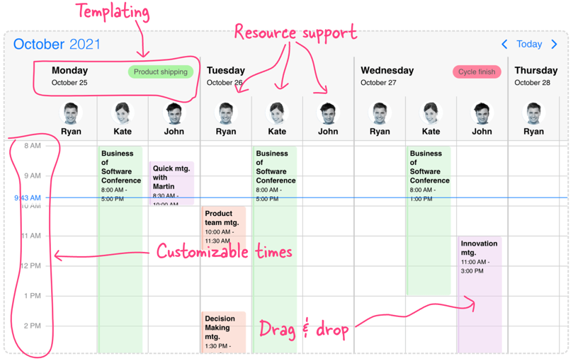
Scheduler
Use the Scheduler view which features a time grid - vertically scrollable daily, weekly and monthly views with built in resource support, templating and more.
Overview
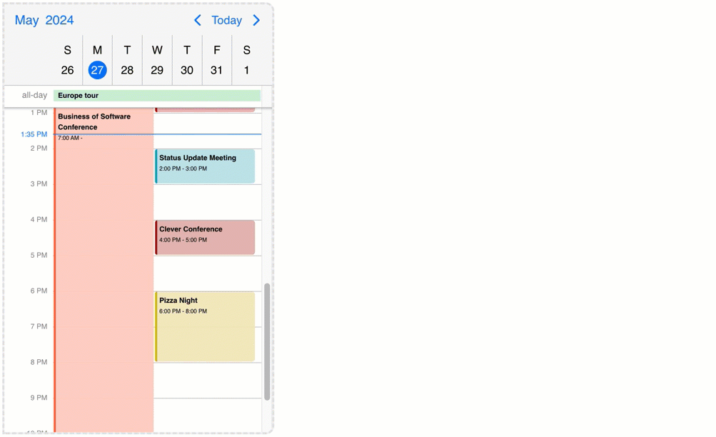
The Scheduler displays a time grid with its related events. It can be configured as a daily, weekly or monthly schedule. Work hours and work days along with disabled time-spans, breaks can be added. Use it for advanced scheduling tasks with built-in drag & drop.
The capabilities like recurring events, all-day, multi-day events, responsiveness are supported by the Scheduler.
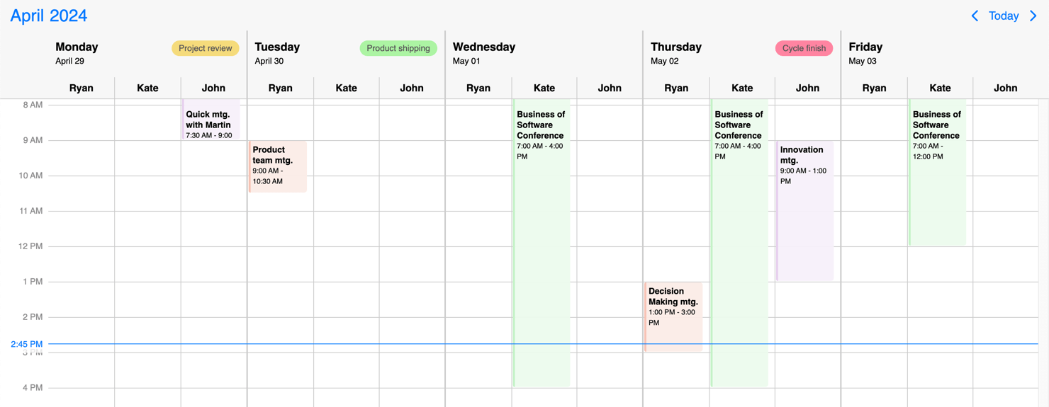
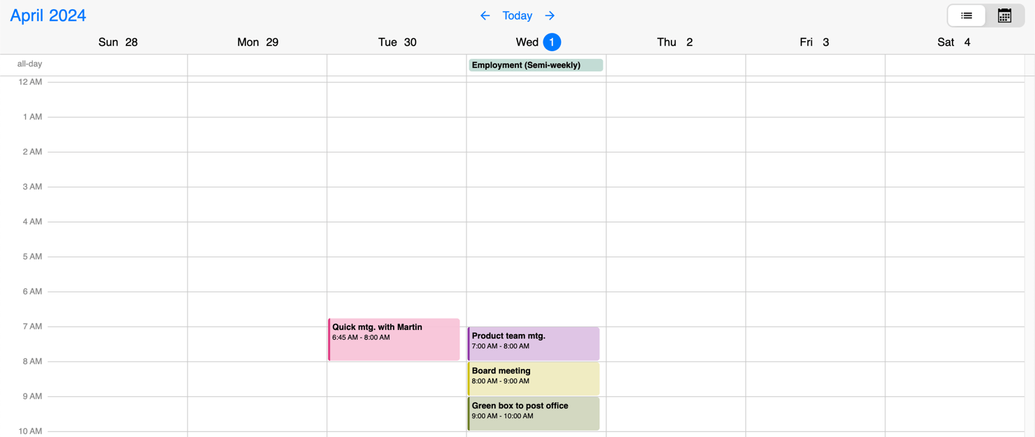
Showing the Scheduler
View combination
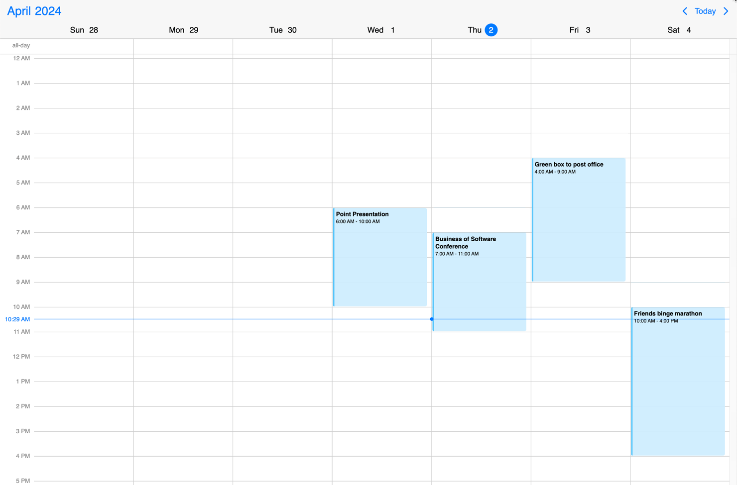
The four views - scheduler, calendar, timeline, agenda - can be used alone or combined with each-other to create the perfect user experience on mobile, desktop and on everything in-between.
For example, the daily Scheduler can also be combined with the Calendar week view. The view option will look like the following:
$('#scheduler').mobiscroll().eventcalendar({
  view: {
    calendar: {
      type: 'week'
    },
    schedule: {
      type: 'day'
    }
  }
});
Configuring the view
The Scheduler view can be configured through the view option. Below are listed the schedule object properties which can help you fine-tune this view.
$('#scheduler').mobiscroll().eventcalendar({
  view: {
    schedule: {
      type: 'week',
      startDay: 1,
      endDay: 5,
      startTime: '09:00',
      endTime: '17:00',
      timeCellStep: 60,
      timeLabelStep: 60,
      currentTimeIndicator: true
    }
  }
});
view
MbscEventcalendarView
schedule: Configures the scheduler view. Properties:
type: 'day' | 'week' | 'month' (default'week') - Sets the scheduler type.size: number (default:1)- Specifies the number of displayed months, weeks or days.allDay: boolean (defaulttrue) - Show or hide the all day events.currentTimeIndicator: boolean (defaulttrue) - Show or hide the current time indicator.days: boolean (defaulttrue) - Show or hide week days above the scheduler grid.startDay: number (default0) - Specifies the first visible weekday of the view. Sunday is 0, Monday is 1, etc. Days outside of thestartDayandendDayrange will not be visible. Should not be mistaken for the firstDay option, which sets the first day of the week, and, if not set, is defined by the localization.endDay: number (default6) - Specifies the last visible weekday of the view. Sunday is 0, Monday is 1, etc.startTime: string (default'00:00') - Set the start time of scheduler column. Hours and minutes can be specified in the same string, example:'09:30'.endTime: string (default'24:00') - Set the end time of scheduler column. Hours and minutes can be specified in the same string, example:'18:30'.maxEventStack: 'all' | 'auto' | number - Limit the number of displayed events. When the number of overlapping events reaches the specified value, a "more" button will be displayed which opens a popover showing the rest of the events.- If it is a
number, it specifies how many events will be displayed before the "more" button appears. - If set to
'all', all events will be displayed. - If set to
'auto', the component will decide how many events can be placed inside the column, based on theminEventWidthview option and the actual column width.
- If it is a
minEventWidth: number - Specifies the minimum event width. Will be used whenmaxEventStack: 'auto'is used.timeCellStep: number (default60) - Set the step of the grid cells in minutes. Supported values: 1, 5, 10, 15, 20, 30, 60, 120, 180, 240, 360, 480, 720, 1440.timeLabelStep: number (default60) - Set the step of the time labels in minutes. Supported values: 1, 5, 10, 15, 20, 30, 60, 120, 180, 240, 360, 480, 720, 1440.timezones: Array<string | object> - Display times in multiple timezones on the time scale and time indicator. The timezones array can contain timezone strings or objects with timezone and label properties. Timezone strings must use the name from the IANA time zone database. If no label is provided, the time column label will be UTC +/- the timezone offset.timezones: ['Europe/Berlin','Europe/Bucharest']timezones: [
{ timezone: 'America/Chicago', label: 'CHI'},
{ timezone: 'America/New_York', label: 'NY'}
]
Row height
There might be cases when you would like to change the height of the schedule cell. You can use the following CSS classes for this purpose:
.mbsc-schedule-time-wrapper,
.mbsc-schedule-item {
  height: 20px;
}
Column width
You can use the following CSS classes for changing column widths of the Scheduler:
.mbsc-schedule-col-width {
  width: 100px;
}
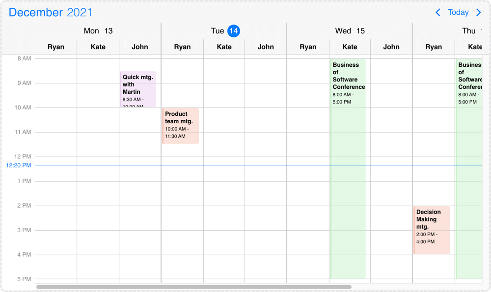
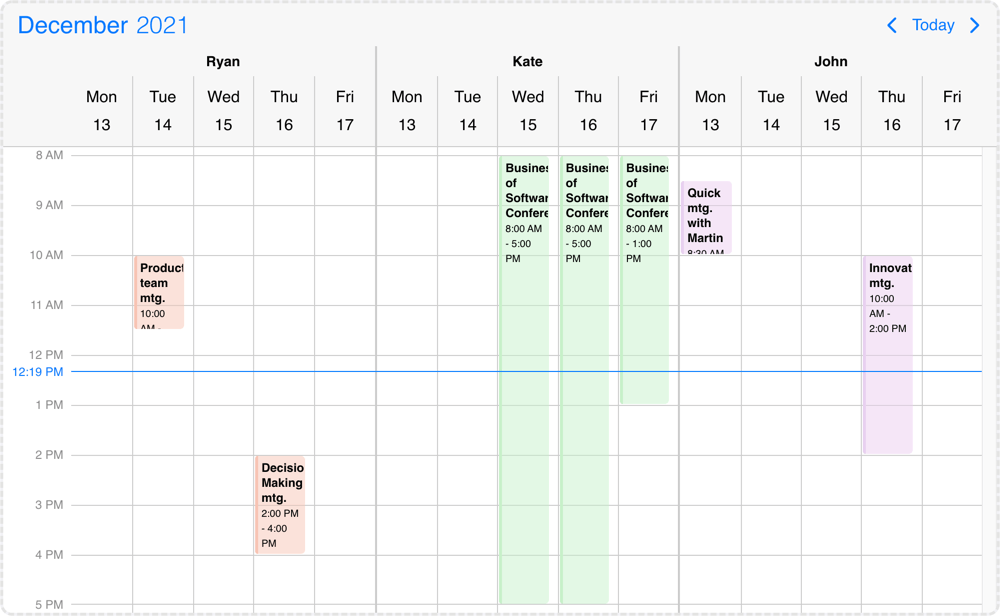
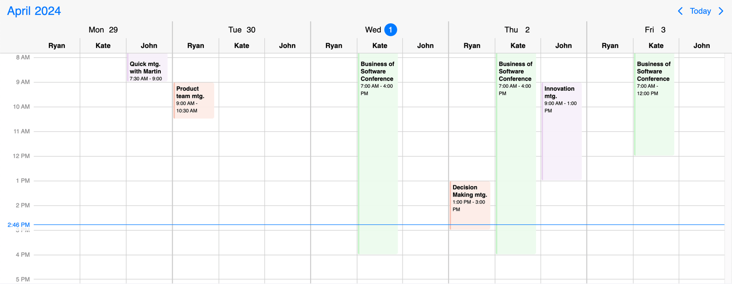
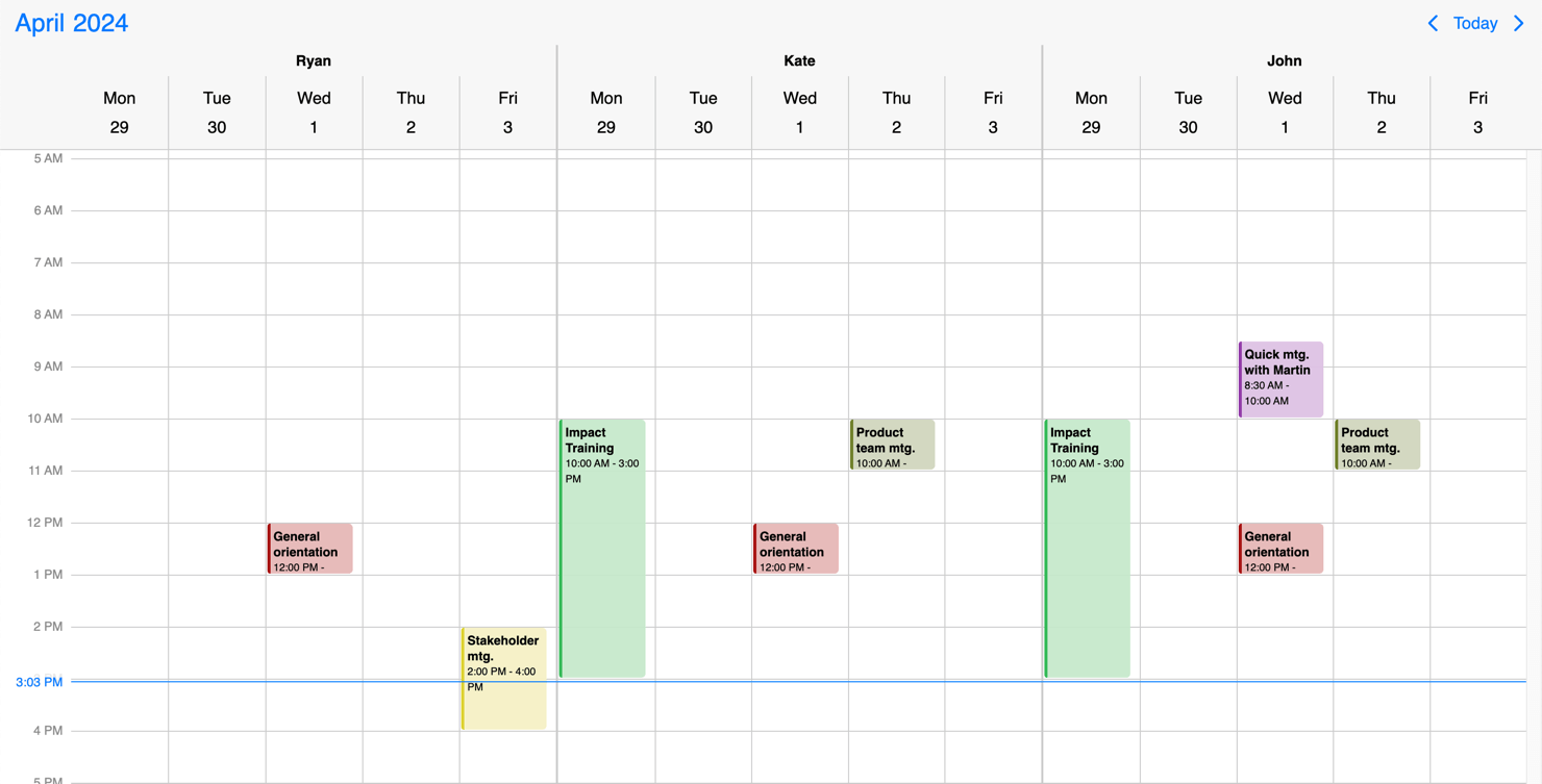
Resource grouping
The Scheduler view can display multiple resources inside a single instance. By default the displayed resources will be grouped by the given resources and the grouping can be changed with the groupBy option, which also supports grouping by date.
$('#scheduler').mboiscroll().eventcalendar({
  groupBy: 'date',
  resources: [{
    id: 1,
    name: 'Ryan',
    color: '#f7c4b4'
  }, {
    id: 2,
    name: 'Kate',
    color: '#c6f1c9'
  }, {
    id: 3,
    name: 'John',
    color: '#e8d0ef'
  }]
});
The color property controls the default event color of the resource. If an event doesn't have a specified color it will inherit from the resource. The agenda and calendar view events and labels will also inherit the resource color.
Events, colors, invalids can be tied to a single or multiple resources. This can be done with the resource property of the objects, where the id of the resource should be passed. It can be a single value where the element would be linked to a single resource or in case of an array the element will show up at all of the specified resources. If no resource property is specified to the color/event/invalid object then the element will show up in every resource group.
$('#scheduler').mboiscroll().eventcalendar({
  invalid: [{
    resource: 1, // this invalid will be displayed only in resource group where id is 1
    start: '13:00',
    end: '12:00',
    recurring: { repeat: 'weekly', weekDays: 'MO,TU,WE,TH,FR' },
    title: 'Lunch break'
  }]
});
$('#scheduler').mboiscroll().eventcalendar({
  data: [{
    resource: [2, 3] // this event will be displayed in resource groups where id is 2 and 3
    start: new Date(2021, 5, 23),
    end: new Date(2021, 5, 30),
    title: 'Conference',
    allDay: true,
  }]
});
$('#scheduler').mboiscroll().eventcalendar({
  colors: [{
    // this color will display at every resource group
    start: new Date(2021, 5, 12, 16),
    end: new Date(2021, 5, 12, 17),
    color: "green",
  }]
});
Responsiveness
The Scheduler is fully responsive. It adapts to the available space and fills the screen to look good everywhere. While you don't have to worry about the width the height can be manually adjusted with the height option. This specifies different options for different container widths, in a form of an object, where the keys are the name of the breakpoints, and the values are objects containing the options for the given breakpoint.
Use the responsive option to configure how the calendar behaves on different sized screens. The responsive option is equipped with five breakpoints:
xsmall(up to 575px),small(up to 767px),medium(up to 991px),large(up to 1199px),xlarge(from 1200px).
Also, custom breakpoints can be added if necessary:
my-custom-breakpoint: { breakpoint: 600 }(from 600px up to the next breakpoint).
The available width is queried from the container element of the component and not the browsers viewport like in css media queries.
$('#scheduler').mobiscroll().eventcalendar({
  responsive: {
    xsmall: {
      view: { schedule: { type: 'day' }}
    },
    custom: { // Custom breakpoint, you can use multiple if needed, but each must have a unique name.
      breakpoint: 600,
      view: { schedule: { type: 'week' }}
    }
  }
});
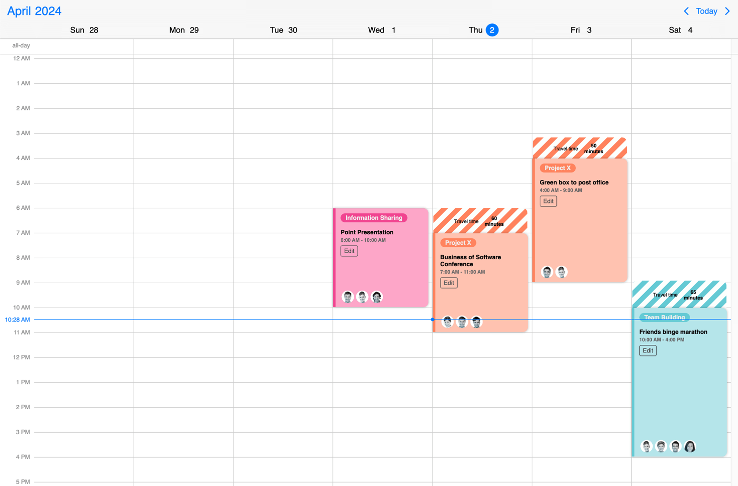
Templating
The display of Scheduler can be customized with different render functions.
The event, their content and buffer areas
The events can be customized in two ways:
- You can use the renderScheduleEvent option to customize the events that appear on the Scheduler. It should return the markup of the event. The Eventcalendar will take care of the positioning, but anything else you want to show is up to you - like a title, description, color the background or show any content.
- If you are looking to customize only the content and don't want to bother with the styling of the event, you can use the renderScheduleEventContent option. Mobiscroll will position the event to the right place and will render essential information like the color of the event, the time and if it's an all day event or not. The title, description and any other fields you want to show (like participants or an avatar) will be coming from your custom function.
The buffers can be customized through the renderBufferBefore and renderBufferAfter options. These can help you visualise delays or added minutes for tasks. For example travel time for meetings/appointments, check in/check out for flights.
Check out how you can style event, their content and buffer areas in this example or just play with the slider below to see the differences.
The date header
There are two approaches you can take:
- Customize the date headers of the Scheduler with the renderDay option by adding relevant content, labels or completely change how they look. It takes a function that should return the desired markup. The Eventcalendar will take care of the positioning, but everything else (like background color, hover effect, etc.) is left to you. The render function will receive an object as parameter. This data can be used to show day specific things on the Scheduler.
- If you are looking to customize only the content and don't want to bother with the styling of the event, you can use the renderDayContent option. You will get the styling taken care of by the Eventcalendar, and you can focus on what you show besides the day number. The template will receive an object as data. This data can be used to show day specific things on the Scheduler.
Check out how you can style the date header in this example or just play with the slider below to see the differences.
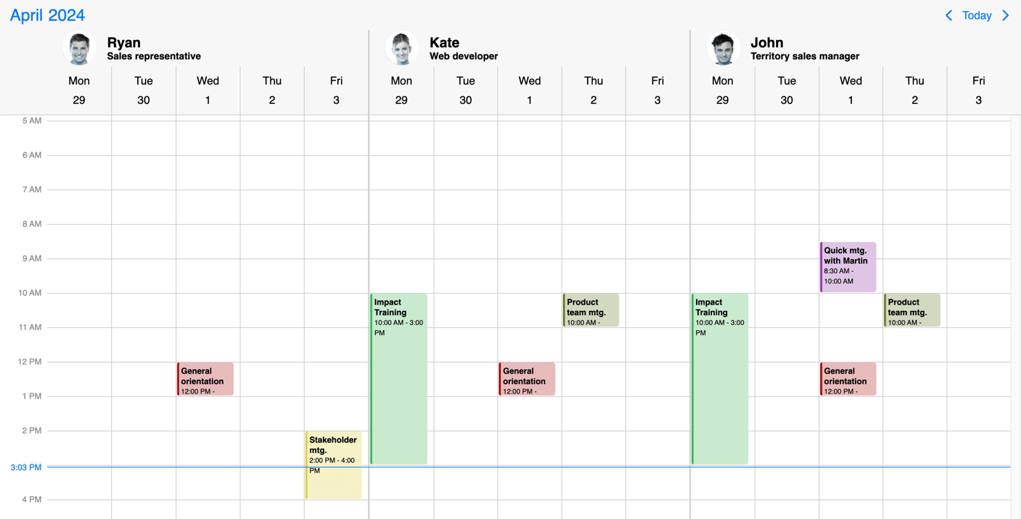
The resource header
Use the renderResource option to customize the resource template of the Scheduler. Customize how the resource headers look and what they show. Utilize properties passed in the resources array. It takes a function that should return the desired markup. In the returned markup, you can use custom html as well.
Check out how you can style the resources in this example or just play with the slider below to see the differences.
The scheduler header
Customize how the header of the Scheduler looks and how the components are arranged with the renderHeader option. It takes a function that should return the desired markup. In the returned markup, you can use custom html as well as the built in header components of the calendar.
While fully customizing the header is very usefull, sometimes it's desireable to customize only parts of it. In this case you can take advantage of the default header's building blocks. These components let you put toghether the header you want, while you don't have to worry about the functionality behind them.
Check out how you can style the Scheduler header in this example or just play with the slider below to see the differences.
API
Here is a comprehensive list of all the specific options, events and methods of the Scheduler view.
Options
clickToCreate
boolean | "double" | "single"
Enable new event creation on click. If true or 'double', a new event will be created only with a double click
and with the 'single' value the event will be created instantly with a single click.
This option will only work on desktop environment where mouse events are fired. It will also allow deleting of the focused events using the Delete or Backspace key.
In touch environment a long tap should be used to create a new event and it is controlled by the dragToCreate option.
Using the extendDefaultEvent option extra properties can be set for the created event.
The event deletion functionality can be overwritten using the eventDelete option.
Default value: undefined
colors
Array<MbscCalendarColor>
Specifies the color for certain dates or date ranges on the calendar. The color object has the following properties:
allDay: boolean - Specifies whether the date you want to color is all day or not.background: string - Background color of the cell, can be any valid CSS color ('red','#ff0000','rgb(255, 0, 0)', etc.).cellCssClass: string - CSS class for the day cell. Only applicable for the calendar view.cssClassstring - Specifies a custom CSS class for the color. Useful when customization is needed for the background of cells and time ranges. Only applicable for the timeline and scheduler views.date: Date | string | object - Date of the calendar day which should be colored.start: Date | string | object - Start of the colored range.end: Date, string | object - End of the colored range.highlight: string - Highlight color of the day, can be any valid CSS color ('red','#ff0000','rgb(255, 0, 0)', etc.).recurring: string | object - Recurrence rule for coloring recurring days.recurringException: string | object | Array<string | object> - Exception dates of the recurring rule. Useful when specific dates need to be skipped from the rule.recurringExceptionRule: string | object - Exception rule of the recurring rule. Useful when recurring dates need to be skipped from the rule.resource: string | number | Array<string | number> - Specifies the resource ids for the color. The color will be displayed only in the specified resource. If there is no resource defined, the color will be displayed in every resource.slot: string | number - Specifies the slot id for the color. The color will be displayed only in the specified slot. If there is no slot defined, the color will be displayed in every slot.textColor: string - Specifies the text color of the colored range title.title: string - Text which will be displayed for the colored range. Only applicable for the timeline and scheduler views.
The colored range will be considered all-day if:
- the
allDayproperty is explicitly set. - the
start/endproperties are not specified, only thedate.
The dates can be specified as JavaScript Date objects, ISO 8601 strings, or moment objects.
[
  { date: new Date(2020, 2, 23), background: 'pink' },
  { date: new Date(2020, 2, 24), background: 'green' },
  { background: '#ff0000', recurring: { repeat: 'weekly', weekDays: 'SU' } },
  { background: 'yellow', recurring: { repeat: 'weekly', weekDays: 'SA' } }
]
Default value: undefined
cssClass
string
Specifies a custom CSS class for the component.
Default value: undefined
data
Array<MbscCalendarEvent>
The events for the calendar, as an array of event objects. The event object supports the following properties:
allDay: boolean - Specifies if the event is all day or not.bufferBefore: number - Specifies a buffer time in minutes that will be displayed before the start of the event.bufferAfter: number - Specifies a buffer time in minutes that will be displayed after the end of the event.color: string - The color of the event.cssClassstring - Custom CSS class for the event. Useful when customization is needed on the event level. For example: setting the width for specific events.dragBetweenResources: boolean - Specifies whether the event is movable across resources. It applies for scheduler and timeline views. Has precedence over theeventDragBetweenResourcesproperty of the resource and the dragBetweenResources option.dragInTime: boolean - Specifies whether the event is movable in time. Has precedence over theeventDragInTimeproperty of the resource and the dragInTime option.editable: boolean - Specifies if an event is editable or not. Setting it tofalsedisables drag & drop, resize and delete,end: Date | string | object - The end of the event.overlap: boolean - Specifies whether any overlap is allowed for the event. Has precedence over theeventOverlapproperty of the resource and the eventOverlap option.id: string | number, Number - A unique id for the event. If not specified, the event will get a generated id. and the event will have thembsc-readonly-eventCSS class. With this class, the fixed events will be easily customizable, for example: add opacity or disable the cursor on the fixed events.recurring: string | object - Recurrence rule for the event.recurringException: string | object | Array<string | object> - Exception dates of the recurring rule. Useful when specific dates need to be skipped from the rule.recurringExceptionRule: string | object - Exception rule of the recurring rule. Useful when recurring dates need to be skipped from the rule.resize: boolean - Specifies whether the event is resizable. Has precedence over theeventResizeproperty of the resource and the dragToResize option.resource: string | number | Array<string | number> - Specifies the resource ids for the event. The event will be displayed only in the specified resources. If there is no resource defined, the event will be displayed in every resource.slot: string | number - Specifies the slot id for the event.start: Date | string | object - The start of the event. The event will be displayed only in the specified slot. If there is no slot defined, the event will be displayed in every slot.title: string - The title of the event.tooltip: string - The tooltip text of the event.
The dates can be specified as JavaScript Date objects, ISO 8601 strings, or moment objects.
The event objects may have additional custom properties as well. The custom properties are not used by the event calendar, but they are kept and will be available anywhere the event objects are used. E.g. the onEventClick event will receive the event object as argument, containing the custom properties as well.
Use the getEvents method to get the events between two dates.
data: [
  {
    start: new Date(2021, 5, 23),
    end: new Date(2021, 5, 30),
    title: 'Conference',
    allDay: true,
    color: 'red'
  },
  {
    title: 'Work project',
    recurring: {
      repeat: 'daily',
      until: '2021-04-01'
    },
    recurringException: ['2021-03-15', '2021-03-25'],
    recurringExceptionRule: {
      repeat: 'weekly',
      weekDays: 'SA,SU'
    }
  }
]
Default value: undefined
dataTimezone
string
The timezone in which the data is interpreted. If the data contains timezone information
(when the ISO string has a timezone offset, e.g. "2021-03-28T01:00:00Z" or "2021-03-28T03:00:00+03:00")
then the data's timezone is used instead.
When using timezones, the exclusiveEndDates option is also turned on by default.
When using anything other than the default ('local'), a timezone plugin
must be also passed to the component.
Possible values:
'local'- The system's local timezone.'utc'- UTC (Universal Coordinated Time) timezone.- Timezone name - The timezone name from the
IANA time zone database, e.g.
"America/New_York".
If not specified, it defaults to the displayTimezone.
Default value: undefined
defaultSelectedDate
MbscDateType
Specifies the initial selected date on the calendar.
For views, where time is also displayed, the view will be scrolled to the specified time. If the time part is not explicitly specified, it defaults to the start of the day.
Default value: undefined
displayTimezone
string
The timezone in which the data is displayed.
When using timezones, the exclusiveEndDates option is also turned on by default.
When using anything other than the default ('local'), a timezone plugin
must be also passed to the component.
Possible values:
'local'- The system's local timezone.'utc'- UTC (Universal Coordinated Time) timezone.- Timezone name - The timezone name from the
IANA time zone database, e.g.
"America/New_York".
Default value: 'local'
dragBetweenResources
boolean
If false, the events will not be moveable across resources, only in time.
To control movement in time, use the dragInTime option.
Consider that dragToMove has to be enabled.
Default value: true
dragInTime
boolean
If false, the events will not be moveable in time.
In case of the scheduler and timeline views events events can still be moved between resources.
To control movement between resources, use the dragBetweenResources option.
Consider that dragToMove has to be enabled.
Default value: true
dragTimeStep
number
Specifies the steps in minutes for the scheduler and timeline events during drag.
Default value: 15
dragToCreate
boolean
If true, dragging on an empty cell will create a new event.
It will also allow deleting of the focused events using the Delete or Backspace key.
The title of the new event can be specified with the newEventText option.
Using the extendDefaultEvent option extra properties can be set for the created event.
The event deletion functionality can be overwritten using the eventDelete option.
Default value: undefined
dragToMove
boolean
If true, the events will be moveable.
Default value: undefined
dragToResize
boolean
If true, the events will be resizable.
Default value: undefined
eventDelete
boolean
Enables or disables event deletion. When true, the focused event will be deleted on pressing the Delete or Backspace
keys on the keyboard.
By default the event deletion depends on the clickToCreate and dragToCreate options.
If either of those are true, and no eventDelete option is set, then event deletion is also enabled, otherwise not.
Default value: undefined
eventOverlap
boolean
If false, the events cannot overlap.
Default value: true
exclusiveEndDates
boolean
If true, the Eventcalendar will work in exclusive end dates mode,
meaning that the last moment of the range (event, invalid, colors, etc.) is not part of the range.
E.g. end: '2021-07-03T00:00' means that the event ends on 2nd of July and will not be displayed on 3rd of July.
When using timezones, the exclusiveEndDates option will default to true.
extendDefaultEvent
(args: MbscNewEventData) => MbscCalendarEvent
Use this option to set properties to the new event created with click or drag. The event creation is handled by the clickToCreate and dragToCreate options. It takes a function that should return the properties for the new event. The argument object passed to this function has the following properties:
start: Date - The date when the newly created event will start.resource: string | number - The id of the resource where the event creation started.
extendDefaultEvent: (args) => {
  return {
    color: args.resource === 'admin' ? 'green' : 'red',
    title: 'My event',
  };
}
Default value: undefined
externalDrag
boolean
If true, external drag & drop is allowed and events can be dragged outside of the component view.
Default value: undefined
externalDrop
boolean
If true, external events can be dragged into the view.
Default value: undefined
groupBy
"resource" | "date"
Groups the events by date or by resource.
Default value: 'resource'
height
string | number
Sets the height of the component.
The height of the calendar view impacts the number of labels that fit into a table cell. A "show more" label will be displayed for events that don't fit.
Default value: undefined
immutableData
boolean
If true, the Eventcalendar will work in immutable mode.
In this mode the component won't update the data directly,
only fire the necessary lifecycle events, where the original data can be updated manually.
Default value: undefined
invalid
Array<MbscDateType> | Array<IValidateProps>
An array containing the invalid values. Can contain dates, or objects with the following properties:
allDay: boolean - Specifies whether the invalid range is all day or not.start: Date | string | object - Start of the invalid range.end: Date, string | object - End of the invalid range.recurring: string | object - Recurrence rule for recurring invalid ranges.recurringException: string | object | Array<string | object> - Exception dates of the recurring rule. Useful when specific dates need to be skipped from the rule.recurringExceptionRule: string | object - Exception rule of the recurring rule. Useful when recurring dates need to be skipped from the rule.resource: string | number | Array<string | number> - Specifies the resource ids for the invalid range. The invalid range will be displayed only in the specified resource. If there is no resource defined, the invalid range will be displayed in every resource.slot: string | number - Specifies the slot id for the invalid range. The invalid range will be displayed only in the specified slot. If there is no slot defined, the invalid range will be displayed in every slot.title: string - Text which will be displayed for the invalid range. Only applicable for the timeline and scheduler views.
The dates can be specified as JavaScript Date objects, ISO 8601 strings, or moment objects.
[
  // Passing exact dates and times
  new Date(2021, 1, 7), // Date object
  '2021-10-15T12:00', // ISO 8601 string
  moment('2020-12-25'), // moment object

  // Passing invalid ranges
  {
    // ISO 8601 strings
    start: '2021-10-15T12:00',
    end: '2021-10-18T13:00',
    title: 'Company 10th anniversary',
  },
  {
    // Date objects
    allDay: true,
    start: new Date(2021, 2, 7),
    end: new Date(2021, 2, 9),
    title: 'Conference for the whole team',
  },
  {
    // Time range with recurrence
    start: '13:00',
    end: '12:00',
    recurring: { repeat: 'weekly', weekDays: 'MO,TU,WE,TH,FR' },
    title: 'Lunch break',
  },
  {
    // Disable weekends
    recurring: {
      repeat: 'weekly',
      weekDays: 'SA,SU'
    }
  }
]
Default value: undefined
invalidateEvent
"strict" | "start-end"
Specifies how to validate events against invalid ranges on create/move/resize:
'strict'- The event cannot intersect with an invalid range at all.- `'start-end' - The event start and end cannot be inside an invalid range.
Default value: 'strict'
max
MbscDateType
Maximum date and time. The calendar cannot be navigated beyond the specified maximum date. If navigation is needed, but event creation should not be allowed after a specific date, use the invalid option with daily recurrence starting from the specific date.
Default value: undefined
min
MbscDateType
Minimum date and time. The calendar cannot be navigated beyond the specified minimum date. If navigation is needed, but event creation should not be allowed before a specific date, use the invalid option with daily recurrence until the specific date.
Default value: undefined
refDate
MbscDateType
Specifies the reference date for the view calculation, when multiple days, weeks, months or years are displayed. If not specified, for the scheduler and timeline views will be today's date, for the calendar and agenda views will be 1970/01/01.
It denotes the reference point when calculating the pages going in the future and in the past.
For example if the view type is day, the view size is 3, and the current date is 01/16/2024,
the pages are calculated from this date, so the initial page will contain [01/16/2024, 01/16/2024, 01/17/2024],
the next page [01/18/2024, 01/19/2024, 01/20/2024] and so on.
In case of day view, the reference point will be exactly the specified date. For week, month and year views the reference point will be the start of the week, month or year of the specified day.
Changing the reference date will not navigate the calendar to the specified date, it only recalculates the pages from the new reference date. To navigate the view to a specified date and time, use the selectedDate option.
Default value: undefined
resources
Array<MbscResource>
The scheduler and timeline views can handle multiple resources. Resource grouping can be modified with the help of the groupBy option.
If set to null or undefined, all events will be displayed, regardless of their resource property.
If set to an empty array, only those events will be displayed which are not tied to any resource.
The timeline view can render multiple levels of hierarchy groups. Levels can be added with the help of the children property.
The resource object supports the following properties:
background: string - Background color of the resource row or column.children: Array<MbscResource> - Children resources.collapsed: boolean - The displayed state of the children resources.cssClass: string - Css class for the resource row or column.id: Number, string - The id of the resource.name: string - The name of the resource.color: string - The color sets the default color for the events of the resource. If an event has an explicit color set, the resource color will be overridden. If the color is not set, the events of the resource will inherit the default calendar color.eventCreation: boolean - Disable event creation on specific resources by setting it tofalse. It'strueby default.eventDragBetweenResources: boolean - Specifies whether the events in the specified resource are movable across resources. It applies for scheduler and timeline views. Has precedence over the dragBetweenResources option.eventDragInTime: boolean - Specifies whether the events in the specified resource are movable in time. Has precedence over the dragInTime option.eventOverlap: boolean - Specifies whether any overlap is allowed for the events in the specified resource. Has precedence over the eventOverlap option.eventResize: boolean - Specifies whether the events in the specified resource are resizable. Has precedence over the dragToResize option.fixed: boolean - Specifies whether the resource is fixed to the top. It applies for timeline view ifresolutionVerticalin view option is not given, or it's value is set tonone. Consider that the fixed resources always have to be the first elements of the array in a sequence (no non-fixed resources inserted in between) so that the drag&drop and event creation functionalities to work properly.
resources: [
  {
    id: 1,
    name: 'Flatiron Room',
    color: '#f7c4b4'
  },
  {
    id: 2,
    name: 'The Capital City',
    color: '#c6f1c9'
  },
  {
    id: 3,
    name: 'Heroes Square',
    color: '#e8d0ef'
  }
]
Default value: undefined
responsive
missing
Specifies different options for different container widths, in a form of an object, where the keys are the name of the breakpoints, and the values are objects containing the options for the given breakpoint.
The available width is queried from the container element of the component and not the browsers viewport like in css media queries
There are five predefined breakpoints:
xsmall- min-width: 0pxsmall- min-width: 576pxmedium- min-width: 768pxlarge- min-width: 992pxxlarge- min-width: 1200px
Custom breakpoints can be defined by passing an object containing the breakpoint property specifying the min-width in pixels.
Example:
responsive: {
  small: {
    display: 'bottom'
  },
  custom: { // Custom breakpoint, you can use multiple if needed, but each must have a unique name.
    breakpoint: 600,
    display: 'center'
  },
  large: {
    display: 'anchored'
  }
}
Default value: undefined
selectMultipleEvents
boolean
When true, enables multiple event selection on the calendar.
Default value: false
selectedDate
MbscDateType
Specifies the selected date on the calendar. This can be changed programmatically and when changed the calendar will automatically navigate to the specified date.
For views, where time is also displayed, the view will be scrolled to the specified time. If the time part is not explicitly specified, it defaults to the start of the day.
This does not change the reference date that defines the reference point of the navigation pages. To change the reference point for the navigation (e.g. start the paging from the newly selected date) use the refDate option.
You also need to pass a handler for the onSelectedDateChange event to update the selected date when the date is changed from the calendar.
Default value: undefined
selectedEvents
Array<MbscCalendarEvent>
Specifies the selected events on the calendar. The onSelectedEventsChange event will be fired when the selected events change from the calendar.
Default value: undefined
separator
string
Separator between date and time in the formatted date string.
Default value: ' '
showControls
boolean
Show or hide the calendar header controls: the previous and next buttons, and the current view button together with the year and month picker.
Default value: true
showEventBuffer
boolean
If true, it will display the event buffers defined in the event data.
Default value: true
showEventTooltip
boolean
If false, it will hide the native tooltip that shows up when hovering over an event.
Default value: true
theme
string
Specifies the visual appearance of the component.
If it is 'auto' or undefined, the theme will automatically be chosen based on the platform.
If custom themes are also present, they will take precedence over the built in themes, e.g. if there's an iOS based custom theme,
it will be chosen on the iOS platform instead of the default iOS theme.
Supplied themes:
'ios'- iOS theme'material'- Material theme'windows'- Windows theme
It's possible to modify theme colors or create custom themes.
Make sure that the theme you set is included in the downloaded package.
Default value: undefined
themeVariant
"auto" | "light" | "dark"
Controls which variant of the theme will be used (light or dark).
Possible values:
'light'- Use the light variant of the theme.'dark'- Use the dark variant of the theme.'auto'orundefined- Detect the preferred system theme on devices where this is supported.
To use the option with custom themes, make sure to create two custom themes, where the dark version has the same name as the light one,
suffixed with '-dark', e.g.: 'my-theme' and 'my-theme-dark'.
Default value: undefined
timezonePlugin
MbscTimezonePlugin
Specifies the timezone plugin, which can handle the timezone conversions.
By default the component uses the local timezone of the browser to interpret dates. If you want to interpret dates a different timezone, you will need an external library to handle the timezone conversions. There are two supported libraries: moment-timezone and luxon.
You can specify either the dataTimezone or the displayTimezone or both.
Depending on which external library you use you can pass either the momentTimezone or luxonTimezone
objects. These objects can be imported from the mobiscroll bundle.
Default value: undefined
width
string | number
Sets the width of the component.
Default value: undefined
Events
onCellClick
(args: MbscCellClickEvent, inst: EventcalendarBase) => void
Triggered when a cell is clicked on the calendar day, scheduler cell, or timeline cell.
Parameters:
args - The event object has the following properties:
date: Date - The date of the clicked cell.domEvent: Event - The DOM event of the click.events: Array<MbscCalendarEvent> - The events for the clicked date.resource: string | number - The id of the resource where the cell was clicked, if resources are set.selected: boolean - Specifies if the day is currently selected or not (before it was clicked).source: 'calendar' | 'schedule' | 'timeline' - The view where the cell was clicked.target: HTMLElement - The DOM element of the clicked cell.
inst - The component instance.
onCellDoubleClick
(args: MbscCellClickEvent, inst: EventcalendarBase) => void
Triggered when a cell is double-clicked on the calendar day, scheduler cell, or timeline cell.
Parameters:
args - The event argument with the following properties:
date: Date - The date of the clicked cell.domEvent: Event - The DOM event of the click.events: Array<MbscCalendarEvent> - The events for the clicked date.resource: string | number - The id of the resource where the cell was clicked, if resources are set.selected: boolean - Specifies if the day is currently selected or not (before it was clicked).source: 'calendar' | 'schedule' | 'timeline' - The view where the cell was clicked.target: HTMLElement - The DOM element of the clicked cell.
inst - The component instance.
onCellRightClick
(args: MbscCellClickEvent, inst: EventcalendarBase) => void
Triggered when a cell is right-clicked on the calendar, scheduler, or timeline grid .
Parameters:
args - The event argument with the following properties:
date: Date - The date of the clicked cell.domEvent: Event - The DOM event of the click.events: Array<MbscCalendarEvent> - The events for the clicked date.resource: string | number - The id of the resource where the cell was clicked, if resources are set.selected: boolean - Specifies if the day is currently selected or not (before it was clicked).source: 'calendar' | 'schedule' | 'timeline' - The view where the cell was clicked.target: HTMLElement - The DOM element of the clicked cell.
inst - The component instance.
onDestroy
(args: any, inst: any) => void
Triggered when the component is destroyed.
Parameters:
args - The event argument object.
inst - The component instance.
onEventClick
(args: MbscEventClickEvent, inst: EventcalendarBase) => void
Triggered when an event is clicked.
Parameters:
args - The event argument with the following properties:
date: Date - The date on which the event was clicked.domEvent: Event - The DOM event of the click.event: MbscCalendarEvent - The clicked calendar event.resource: string | number - The id of the resource where the event was clicked, if resources are set.selected: boolean - Specifies if the day is currently selected or not (before it was clicked).slot: string | number - The id of the slot where the event was clicker, if slots are set.source: 'agenda' | 'calendar' | 'schedule' | 'timeline' | 'popover' - The view where the event was clicked.
inst - The component instance.
onEventCreate
(args: MbscEventCreateEvent, inst: EventcalendarBase) => void
Triggered when an event is about to create and it is not yet rendered on its final position.
Event creation can be prevented by returning false from the handler function.
Parameters:
args - The event argument with the following properties:
action: 'click' | 'drag' | 'externalDrop' - The action which created the event.domEvent: Event - The DOM event from the end of the gesture (mouseup or touchend).event: MbscCalendarEvent - The newly created event.originEvent: MbscCalendarEvent - The occurrence of the event which was dragged. Will be set only if the event was created by dragging a recurring event occurrence.source: 'calendar' | 'timeline' | 'schedule' - The view where the event is being created.
inst - The component instance.
onEventCreateFailed
(args: MbscEventCreateFailedEvent, inst: EventcalendarBase) => void
Triggered when an event creation failed due to overlapping an invalid range or another event.
Parameters:
args - The event argument with the following properties:
action: 'click' | 'drag' | 'externalDrop' - The action which created the event.event: MbscCalendarEvent - The newly created event.invalid: object - The invalid object which the event overlapped.overlap: MbscCalendarEvent - The overlapped event.originEvent: MbscCalendarEvent - The occurrence of the event which was dragged. Will be set only if the event was created by dragging a recurring event occurrence.source: 'calendar' | 'timeline' | 'schedule' - The view where the event was created.
inst - The component instance.
onEventCreated
(args: MbscEventCreatedEvent, inst: EventcalendarBase) => void
Triggered when an event is created and it is rendered in its position.
Parameters:
args - The event argument with the following properties:
action: 'click' | 'drag' | 'externalDrop' - The action which created the event.event: MbscCalendarEvent - The newly created event.source: 'calendar' | 'timeline' | 'schedule' - The view where the event was created.target: HTMLElement - The DOM element of the created event.
inst - The component instance.
onEventDelete
(args: MbscEventDeleteEvent, inst: EventcalendarBase) => void
Triggered when an event is about to be deleted and it is not yet removed from the view.
Event deletion can be performed with delete and backspace button on an active event.
Deletion can be prevented by returning false from the handler function.
Parameters:
args - The event argument with the following properties:
domEvent: Event - The DOM event from of the keydown action.event: MbscCalendarEvent - The event being deleted.events: Array<MbscCalendarEvent> - The events being deleted in case of multiple event selection.source: 'agenda' | 'calendar' | 'timeline' | 'schedule' - The view where the event is being deleted.
inst - The component instance.
onEventDeleted
(args: MbscEventDeletedEvent, inst: EventcalendarBase) => void
Triggered when an event is deleted and it is removed from the view.
Parameters:
args - The event argument with the following properties:
event: MbscCalendarEvent - The deleted event.events: Array<MbscCalendarEvent> - The deleted events in case of multiple event selection.source: 'agenda' | 'calendar' | 'timeline' | 'schedule' - The view where the event was deleted.
inst - The component instance.
onEventDoubleClick
(args: MbscEventClickEvent, inst: EventcalendarBase) => void
Triggered when an event is double-clicked.
Parameters:
args - The event argument with the following properties:
date: Date - The date on which the event was clicked.domEvent: Event - The DOM event of the click.event: MbscCalendarEvent - The clicked calendar event.resource: string | number - The id of the resource where the event was clicked, if resources are set.selected: boolean - Specifies if the day is currently selected or not (before it was clicked).slot: string | number - The id of the slot where the event was clicker, if slots are set.source: 'agenda' | 'calendar' | 'schedule' | 'timeline' | 'popover' - The view where the event was clicked.
inst - The component instance.
onEventDragEnd
(args: MbscEventDragEvent, inst: EventcalendarBase) => void
Triggered when an event drag has ended.
Parameters:
args - The event argument with the following properties:
domEvent: Event - The DOM event of the drag.event: MbscCalendarEvent - The dragged calendar event.resource: string | number - The id of the resource where the event was dragged, if resources are set.slot: string | number - The id of the slot where the event was dragged, if slots are set.source: 'calendar' | 'schedule' | 'timeline' - The view where the event was dragged.
inst - The component instance.
onEventDragEnter
(args: MbscEventDragEvent) => void
Triggered when an event is dragged into the calendar/timeline/schedule view.
Parameters:
- args - The event argument with the following properties:
domEvent: Event - The DOM event of the drag.event: MbscCalendarEvent - The dragged calendar event.source: 'calendar' | 'schedule' | 'timeline' - The view where the event is dragged.
onEventDragLeave
(args: MbscEventDragEvent) => void
Triggered when an event is dragged out form the calendar/timeline/schedule view.
Parameters:
- args - The event argument with the following properties:
domEvent: Event - The DOM event of the drag.event: MbscCalendarEvent - The dragged calendar event.source: 'calendar' | 'schedule' | 'timeline' - The view where the event is dragged.
onEventDragStart
(args: MbscEventDragEvent, inst: EventcalendarBase) => void
Triggered when an event drag has started.
Parameters:
args - The event argument with the following properties:
action: 'create' | 'resize' | 'move' - The user action which triggered the event.domEvent: Event - The DOM event of the drag.event: MbscCalendarEvent - The dragged calendar event.resource: string | number - The id of the resource where the event is dragged, if resources are set.slot: string | number - The id of the slot where the event is dragged, if slots are set.source: 'calendar' | 'schedule' | 'timeline' - The view where the event is dragged.
inst - The component instance.
onEventHoverIn
(args: MbscEventClickEvent, inst: EventcalendarBase) => void
Triggered when the mouse pointer hovers an event on the calendar.
Parameters:
args - The event argument with the following properties:
date: Date - The date on which the event is hovered.domEvent: Event - The DOM event of the hover.event: MbscCalendarEvent - The hovered calendar event.resource: string | number - The id of the resource where the event is hovered, if resources are set.slot: string | number - The id of the slot where the event is hovered, if slots are set.source: 'agenda' | 'calendar' | 'schedule' | 'timeline' | 'popover' - The view where the event is hovered.
inst - The component instance.
onEventHoverOut
(args: MbscEventClickEvent, inst: EventcalendarBase) => void
Triggered when the mouse pointer leaves an event on the calendar.
Parameters:
args - The event argument with the following properties:
date: Date - The date on which the event was hovered.domEvent: Event - The DOM event of the hover.event: MbscCalendarEvent - The hovered calendar event.resource: string | number - The id of the resource where the event was hovered, if resources are set.slot: string | number - The id of the slot where the event was hovered, if slots are set.source: 'agenda' | 'calendar' | 'schedule' | 'timeline' | 'popover' - The view where the event was hovered.
inst - The component instance.
onEventRightClick
(args: MbscEventClickEvent, inst: EventcalendarBase) => void
Triggered when an event is right-clicked.
Parameters:
args - The event argument with the following properties:
date: Date - The date on which the event was clicked.domEvent: Event - The DOM event of the click.event: MbscCalendarEvent - The clicked calendar event.resource: string | number - The id of the resource where the event was clicked, if resources are set.selected: boolean - Specifies if the day is currently selected or not (before it was clicked).slot: string | number - The id of the slot where the event was clicker, if slots are set.source: 'agenda' | 'calendar' | 'schedule' | 'timeline' | 'popover' - The view where the event was clicked.
inst - The component instance.
onEventUpdate
(args: MbscEventUpdateEvent, inst: EventcalendarBase) => void
Triggered when an event is about to update. Update can be prevented by returning false from the handler function.
Parameters:
args - The event argument with the following properties:
domEvent: Event - The DOM event from the end of the gesture (mouseup or touchend).event: MbscCalendarEvent - The updated event.events: Array<MbscCalendarEvent> - The updated events. It is set on recurring event delete, when multiple event selection is enabled.newEvent: MbscCalendarEvent - The newly created event. Will be set only if the dragged event was a recurring event occurrence.oldEvent: MbscCalendarEvent - The original event before the update.oldEvents: Array<MbscCalendarEvent> - The original events before the update. It is set on recurring event delete, when multiple event selection is enabled.oldEventOccurrence: MbscCalendarEvent - The occurrence of the event which was dragged. Will be set only if the dragged event was a recurring event occurrence.oldResource: number | string - The id of the resource from which the event was dragged.oldSlot: number | string - The id of the slot from which the event was dragged.resource: number | string - The id of the resource where the event was dropped.slot: number | string - The id of the slot where the event was dropped.source: 'calendar' | 'timeline' | 'schedule' - The view where the event is being updated.
inst - The component instance.
onEventUpdateFailed
(args: MbscEventUpdateFailedEvent, inst: EventcalendarBase) => void
Triggered when an event update failed due to overlapping an invalid range or another event.
Parameters:
args - The event argument with the following properties:
event: MbscCalendarEvent - The updated event.invalid: object - The invalid object which the event overlapped.overlap: MbscCalendarEvent - The overlapped event.newEvent: MbscCalendarEvent - The newly created event. Will be set only if the dragged event was a recurring event occurrence.oldEvent: MbscCalendarEvent - The original event before the update.oldEventOccurrence: MbscCalendarEvent - The occurrence of the event which was dragged. Will be set only if the dragged event was a recurring event occurrence.source: 'calendar' | 'timeline' | 'schedule' - The view where the event was updated.
inst - The component instance.
onEventUpdated
(args: MbscEventUpdatedEvent, inst: EventcalendarBase) => void
Triggered when an event is updated and is rendered in its new position. This is where you update the event in your database or persistent storage.
Parameters:
args - The event argument with the following properties:
event: MbscCalendarEvent - The updated event.events: Array<MbscCalendarEvent> - The updated events. It is set on recurring event delete, when multiple event selection is enabled.oldEvent: MbscCalendarEvent - The original event before the update.oldEvents: Array<MbscCalendarEvent> - The original events before the update. It is set on recurring event delete, when multiple event selection is enabled.source: 'calendar' | 'timeline' | 'schedule' - The view where the event was updated.target: HTMLElement - The DOM element of the updated event.
inst - The component instance.
onInit
(args: any, inst: any) => void
Triggered when the component is initialized.
Parameters:
args - The event argument object.
inst - The component instance.
onPageChange
(args: MbscPageChangeEvent, inst: EventcalendarBase) => void
Triggered when the calendar page is changed (with buttons or swipe).
Parameters:
args - The event argument with the following properties:
firstDay: Date - The first day of the displayed page.lastDay: Date - The last day of the displayed page.month: Date - The first day of the visible month in case of month view.
inst - The component instance.
onPageLoaded
(args: MbscPageLoadedEvent, inst: EventcalendarBase) => void
Triggered when the calendar page is changed (with buttons or swipe) and the view finished rendering.
Parameters:
args - The event argument with the following properties:
firstDay: Date - The first day of the displayed page.lastDay: Date - The last day of the displayed page.month: Date - The first day of the visible month in case of month view.
inst - The component instance.
onPageLoading
(args: MbscPageLoadingEvent, inst: EventcalendarBase) => void
Triggered before the markup of a calendar page is starting to render.
Parameters:
args - The event argument with the following properties:
firstDay: Date - The first day of the displayed page.lastDay: Date - The last day of the displayed page.month: Date - The first day of the visible month in case of month view.
inst - The component instance.
onSelectedDateChange
(args: MbscSelectedDateChangeEvent, inst: EventcalendarBase) => void
Triggered when the selected date is changed, e.g. by clicking on a day on a calendar view, or by using the navigation arrows. You can use this event in conjunction with the selectedDate option to customize where the Eventcalendar should navigate.
Parameters:
args - The event argument with the following properties:
date: Date - The newly selected date.
inst - The component instance.
onSelectedEventsChange
(args: MbscSelectedEventsChangeEvent, inst: EventcalendarBase) => void
Triggered when an event is selected or deselected on the UI, when multiple event selection is enabled.
You can also select events programmatically using the selectedEvents option.
Parameters:
args - The event argument with the following properties:
events: Array<MbscCalendarEvent> - The selected events.
inst - The component instance.
Localization
allDayText
string
Text for all day events.
Default value: 'All-day'
amText
string
Text for AM.
Default value: 'am'
calendarSystem
MbscCalendarSystem
Specifies the calendar system to be used. Supported calendars:
- Gregorian - Gregorian calendar. This is the default calendar system.
- Jalali - Persian calendar. The Farsi language needs to be included to the package.
- Hijri - Hijri calendar. The Arabic language needs to be included to the package
Default value: undefined
dateFormat
string
The format for parsed and displayed dates:
M- month of year (no leading zero)MM- month of year (two digit)MMM- month name shortMMMM- month name longD- day of month (no leading zero)DD- day of month (two digit)DDD- day of week (short)DDDD- day of week (long)YY- year (two digit)YYYY- year (four digit)'...'- literal text''- single quote- anything else - literal text
Default value: 'MM/DD/YYYY'
dateFormatFull
string
Human readable date format, used by screen readers to read out full dates. Characters have the same meaning as in the dateFormat option.
Default value: 'DDDD, MMMM D, YYYY'
dateFormatLong
string
Long date format, used by the agenda view and timeline day headers. Characters have the same meaning as in the dateFormat option.
Default value: 'D DDD MMM YYYY'
dayNames
Array<string>
The list of long day names, starting from Sunday.
Default value: ['Sunday', 'Monday', 'Tuesday', 'Wednesday', 'Thursday', 'Friday', 'Saturday']
dayNamesMin
Array<string>
The list of minimal day names, starting from Sunday.
Default value: ['S', 'M', 'T', 'W', 'T', 'F', 'S']
dayNamesShort
Array<string>
The list of abbreviated day names, starting from Sunday.
Default value: ['Sun', 'Mon', 'Tue', 'Wed', 'Thu', 'Fri', 'Sat']
firstDay
number
Set the first day of the week: Sunday is 0, Monday is 1, etc.
Default value: 0
locale
string | MbscLocale
Sets the language of the component. The locale object contains all the translations for a given language. The built in language modules are listed below. If a language is not listed, it can be provided as a custom language module.
Supported values:
- Arabic:
localeAr,'ar' - Bulgarian:
localeBg,'bg' - Catalan:
localeCa,'ca' - Czech:
localeCs,'cs' - Chinese:
localeZh,'zh' - Croatian:
localeHr,'hr' - Danish:
localeDa,'da' - Dutch:
localeNl,'nl' - English:
localeEnorundefined,'en' - English (UK):
localeEnGB,'en-GB' - Farsi:
localeFa,'fa' - German:
localeDe,'de' - Greek:
localeEl,'el' - Spanish:
localeEs,'es' - Finnish:
localeFi,'fi' - French:
localeFr,'fr' - Hebrew:
localeHe,'he' - Hindi:
localeHi,'hi' - Hungarian:
localeHu,'hu' - Italian:
localeIt,'it' - Japanese:
localeJa,'ja' - Korean:
localeKo,'ko' - Lithuanian:
localeLt,'lt' - Norwegian:
localeNo,'no' - Polish:
localePl,'pl' - Portuguese (Brazilian):
localePtBR,'pt-BR' - Portuguese (European):
localePtPT,'pt-PT' - Romanian:
localeRo,'ro' - Russian:
localeRu,'ru' - Russian (UA):
localeRuUA,'ru-UA' - Slovak:
localeSk,'sk' - Serbian:
localeSr,'sr' - Swedish:
localeSv,'sv' - Thai:
localeTh,'th' - Turkish:
localeTr,'tr' - Ukrainian:
localeUa,'ua'
Default value: undefined
monthNames
Array<string>
The list of full month names.
Default value: ['January', 'February', 'March', 'April', 'May', 'June', 'July', 'August', 'September', 'October', 'November', 'December']
monthNamesShort
Array<string>
The list of abbreviated month names.
Default value: ['Jan', 'Feb', 'Mar', 'Apr', 'May', 'Jun', 'Jul', 'Aug', 'Sep', 'Oct', 'Nov', 'Dec']
newEventText
string
Title for the newly created event with the dragToCreate and the clickToCreate action.
Default value: 'New event'
nextPageText
string
Text for the next button in the calendar header, used as accessibility label.
Default value: 'Next page'
pmText
string
Text for PM.
Default value: 'pm'
prevPageText
string
Text for the previous button in the calendar header, used as accessibility label.
Default value: 'Previous page'
rtl
boolean
Enables right-to-left display.
Default value: false
timeFormat
string
The format for parsed and displayed times:
h- 12 hour format (no leading zero)hh- 12 hour format (leading zero)H- 24 hour format (no leading zero)HH- 24 hour format (leading zero)m- minutes (no leading zero)mm- minutes (leading zero)s- seconds (no leading zero)ss- seconds (leading zero)a- lowercase am/pmA- uppercase AM/PM'...'- literal text''- single quote- anything else - literal text
Default value: 'hh:mm A'
todayText
string
Text for the "Today" button.
Default value: 'Today'
Renderers
renderBufferAfter
(event: MbscCalendarEventData) => any
Customize the buffer area that is displayed at the end of the scheduler and timeline events.
The buffer can be defined with the help of the bufferAfter property of the event data.
The template will receive an event object as data. Some of the event specific details are computed, but there is also a reference to the original event they come from. The following event specific properties are available:
allDay: string - The localized all-day text in case of all day events.end: string - The formatted end time, if the event is not all day.id: string - The id of the event.isMultiDay: boolean - True if the event spans across multiple days.lastDay: boolean - True if it's rendered on the last day of a multiple event.original: MbscCalendarEvent - The original event object.start: string - The formatted start time, if the event is not all day.title: string - The title of the event.currentResource: string | number - The resource of the row or column where the event is being rendered.
Default value: undefined
renderBufferBefore
(event: MbscCalendarEventData) => any
Customize the buffer area that is displayed at the start of the scheduler and timeline events.
The buffer can be defined with the help of the bufferBefore property of the event data.
The template will receive an event object as data. Some of the event specific details are computed, but there is also a reference to the original event they come from. The following event specific properties are available:
allDay: string - The localized all-day text in case of all day events.end: string - The formatted end time, if the event is not all day.id: string - The id of the event.isMultiDay: boolean - True if the event spans across multiple days.lastDay: boolean - True if it's rendered on the last day of a multiple event.original: MbscCalendarEvent - The original event object.start: string - The formatted start time, if the event is not all day.title: string - The title of the event.currentResource: string | number - The resource of the row or column where the event is being rendered.
Default value: undefined
renderDay
(args: MbscCalendarDayData) => any
Customize the day cells of the calendar view and the date header in case of scheduler and timeline views.
If you are looking to customize only the day cells content and don't want to bother with the styling of the event, in case of calendar and scheduler views you can use the renderDayContent option.
The following day specific details are available:
date: Date - The date of the rendered day.selected: boolean - True if the date is selected (in case of the calendar view).events: Array<MbscCalendarEvent> - The list of events for the day.resource: string | number - The id of the resource in case of the scheduler (week and month views) when the events are grouped by resources.isActive: boolean - True for the current day (in case of the timeline view).
Default value: undefined
renderDayContent
(args: MbscCalendarDayData) => any
Customize the day cells content of the event calendar. The Eventcalendar will take care of the styling and you can focus on what you show beside the day number.
If you are looking to fully customize the day (e.g. add custom hover effects) you will need to use the renderDay option.
The following properties are available:
date: Date - The date of the rendered day.selected: boolean - True if the date is selected (in case of the calendar view).events: Array<MbscCalendarEvent> - The list of events for the day.resource: string | number - The id of the resource in case of the scheduler (week and month views) when the events are grouped by resources.
Default value: undefined
renderHeader
() => any
Customize the header of the event calendar. You can use custom markup and the built in header components of the calendar.
Default value: undefined
renderResource
(resource: MbscResource) => any
Customize how the resources are rendered on the scheduler and timeline views. The object of the rendered resource is available for use.
Default value: undefined
renderScheduleEvent
(event: MbscCalendarEventData) => any
Customize the events that appear on the scheduler and timeline. The Eventcalendar will take care of the positioning, but everything else (like background color, hover effect, etc.) is left to you.
If you are looking to customize only the content (e.g. add custom elements) and don't want to bother with the styling of the event, you can use the renderScheduleEventContent option.
Some of the event specific details are computed, but there is also a reference to the original event they come from. The following event specific properties are available:
allDay: string - The localized all-day text in case of all day events.end: string - The formatted end time, if the event is not all day.id: string - The id of the event.isMultiDay: boolean - True if the event spans across multiple days.lastDay: boolean - True if it's rendered on the last day of a multiple event.original: MbscCalendarEvent - The original event object.start: string - The formatted start time, if the event is not all day.title: string - The title of the event.currentResource: string | number - The resource of the row or column where the event is being rendered.
Default value: undefined
renderScheduleEventContent
(event: MbscCalendarEventData) => any
Customize the event content that appears on the scheduler and timeline. The Eventcalendar will take care of styling and you can focus on what you show inside of the event.
If you are looking to fully customize the event (e.g. add custom hover effects) you will need to use the renderScheduleEvent option. In that case you will only get the positioning done by the Eventcalendar and everything else is up to you.
Some of the event specific details are computed, but there is also a reference to the original event they come from. The following event specific properties are available:
allDay: string - The localized all-day text in case of all day events.end: string - The formatted end time, if the event is not all day.id: string - The id of the event.isMultiDay: boolean - True if the event spans across multiple days.lastDay: boolean - True if it's rendered on the last day of a multiple event.original: MbscCalendarEvent - The original event object.start: string - The formatted start time, if the event is not all day.title: string - The title of the event.currentResource: string | number - The resource of the row or column where the event is being rendered.
Default value: undefined