Angular Scheduler Dynamic View Switching
Get started with this exampleUsage
theme: 'ios' You can turn auto theming on and let it decide based on the platform.
Usage
themeVariant: 'light' You can turn auto dark mode on based on system settings.
Usage
  clickToCreate: true,
// click to create is on   dragToCreate: true,
// drag to create is on   dragToMove: true,
// reordering is on   dragToResize: true,
// resizing is on   eventDelete: true
// deleting is on
Fine-tune drag & drop with these options, which are false by default.
Usage
locale: localeEn Selecting the locale loads the localized settings and the translated UI text.
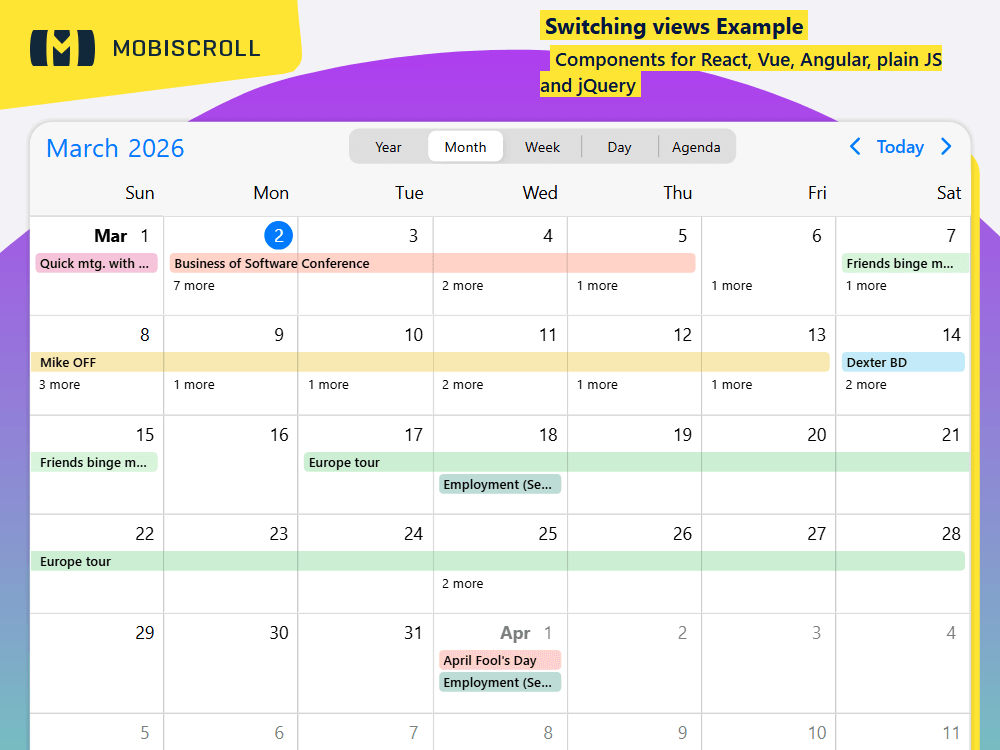
Dynamic View Switching
Dynamically switch views within one instance. Use a UI control to let users do the switching or do it programmatically.
The example features a month view with events as labels, a weekly schedule view, a daily schedule and a weekly agenda. Use property binding and when the value of the property changes the settings propagate.
Demo
Code
import { CommonModule } from '@angular/common';
import { HttpClient } from '@angular/common/http';
import { Component, OnInit } from '@angular/core';
import { FormsModule } from '@angular/forms';
import { MbscCalendarEvent, MbscEventcalendarView, MbscModule, setOptions  } from '@mobiscroll/angular';

setOptions({
  locale:  ,
  theme: ' ',
  themeVariant: ' '
});

@Component({
  selector: 'app-root',
  templateUrl: './app.component.html',
  standalone: true,
  imports: [CommonModule, FormsModule, MbscModule],
})
export class AppComponent implements OnInit {
  constructor(private http: HttpClient) {}

  myEvents: MbscCalendarEvent[] = [];
  view = 'month';
  calView: MbscEventcalendarView = {
    calendar: { labels: true },
  };

  ngOnInit(): void {
    this.http.jsonp<MbscCalendarEvent[]>('https://trial.mobiscroll.com/events/?vers=5', 'callback').subscribe((resp) => {
      this.myEvents = resp;
    });
  }

  changeView(): void {
    setTimeout(() => {
      switch (this.view) {
        case 'year':
          this.calView = {
            calendar: { type: 'year' },
          };
          break;
        case 'month':
          this.calView = {
            calendar: { labels: true },
          };
          break;
        case 'week':
          this.calView = {
            scheduler: { type: 'week' },
          };
          break;
        case 'day':
          this.calView = {
            scheduler: { type: 'day' },
          };
          break;
        case 'agenda':
          this.calView = {
            calendar: { type: 'week' },
            agenda: { type: 'week' },
          };
          break;
      }
    });
  }
}
<div class="md-switching-view-cont">
  <mbsc-eventcalendar [data]="myEvents" [view]="calView" [headerTemplate]="customTemplate">
    <ng-template #customTemplate>
      <mbsc-calendar-nav class="cal-header-nav"></mbsc-calendar-nav>
      <div class="cal-header-picker">
        <mbsc-segmented-group [(ngModel)]="view" (change)="changeView()">
          <mbsc-segmented value="month">Month</mbsc-segmented>
          <mbsc-segmented value="week">Week</mbsc-segmented>
          <mbsc-segmented value="day">Day</mbsc-segmented>
          <mbsc-segmented value="agenda">Agenda</mbsc-segmented>
        </mbsc-segmented-group>
      </div>
      <mbsc-calendar-prev class="cal-header-prev"></mbsc-calendar-prev>
      <mbsc-calendar-today class="cal-header-today"></mbsc-calendar-today>
      <mbsc-calendar-next class="cal-header-next"></mbsc-calendar-next>
    </ng-template>
  </mbsc-eventcalendar>
</div>
.md-switching-view-cont .mbsc-segmented {
  max-width: 350px;
  margin: 0 auto;
}

.md-switching-view-cont .mbsc-calendar-grid-item {
  height: 490px;
  box-sizing: border-box;
}

.cal-header-picker {
  flex: 1 0 auto;
}

.cal-header-nav {
  width: 200px;
}

/* material header order */

.mbsc-material.cal-header-prev {
  order: 1;
}

.mbsc-material.cal-header-next {
  order: 2;
}

.mbsc-material.cal-header-nav {
  order: 3;
}

.mbsc-material .cal-header-picker {
  order: 4;
}

.mbsc-material .cal-header-today {
  order: 5;
}

/* windows header order */

.mbsc-windows.cal-header-nav {
  order: 1;
}

.mbsc-windows.cal-header-prev {
  order: 2;
}

.mbsc-windows.cal-header-next {
  order: 3;
}

.mbsc-windows .cal-header-picker {
  order: 4;
}

.mbsc-windows .cal-header-today {
  order: 5;
}